Accord digital magazine
Design a new interactive
Client: Accord – Trade Union
Services: UX design, UI design, Web design.
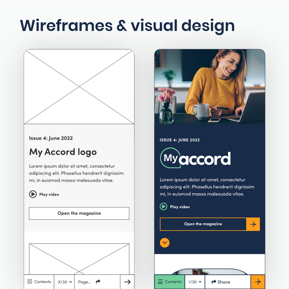
The trade union Accord came to Studio Republic with the challenge of evolving their quarterly magazine into an innovative digital format. The cost and environmental impact of creating a printed magazine was unsustainable and this presented the opportunity to create a digital solution. The challenge was to create a digital magazine that would engage their members and provide Accord with the tools to create unique issues each time allowing them to display a wide variety of content. This was a project where I lead throughout and built the user journeys, wireframes and visual prototypes after the brand elements had been created.
The solution
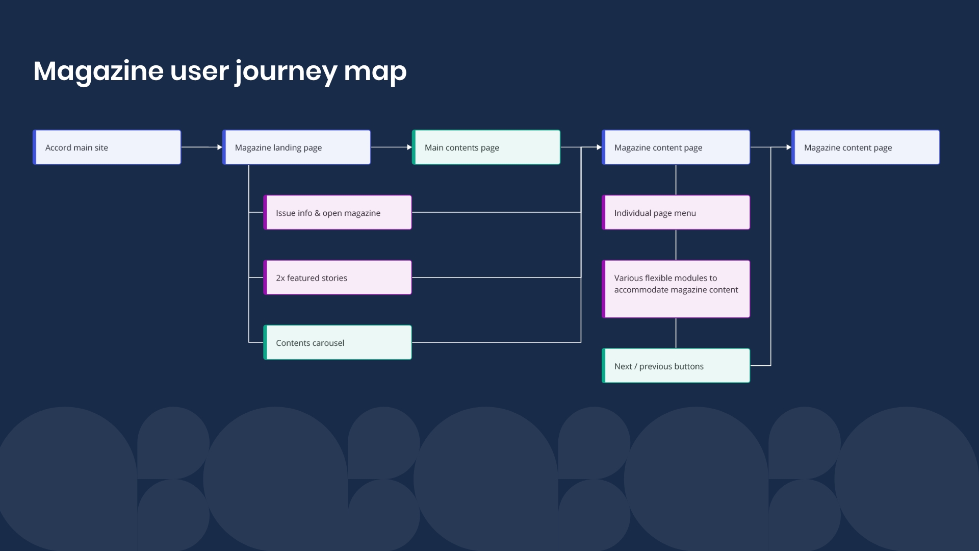
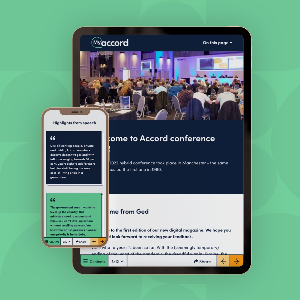
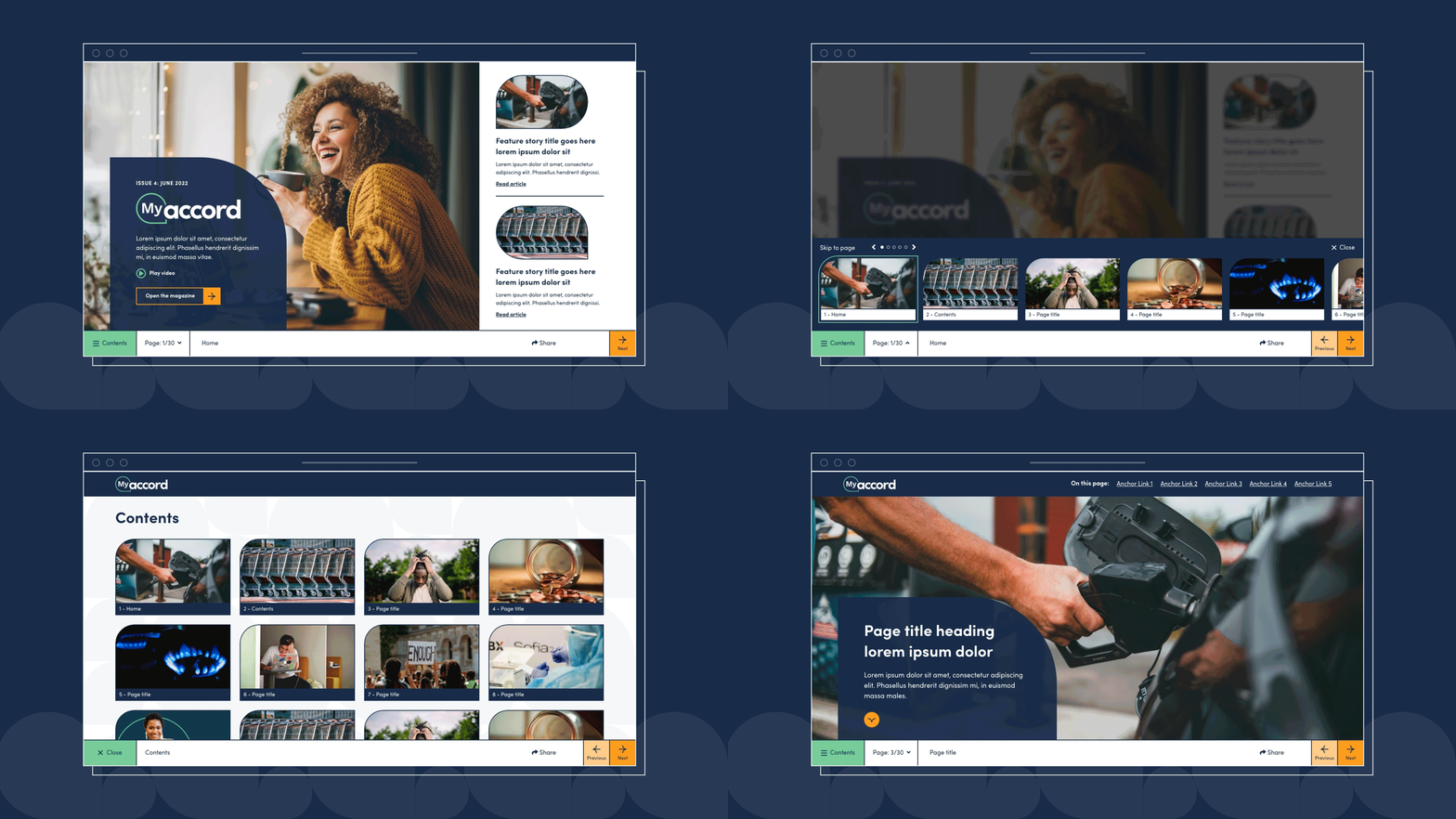
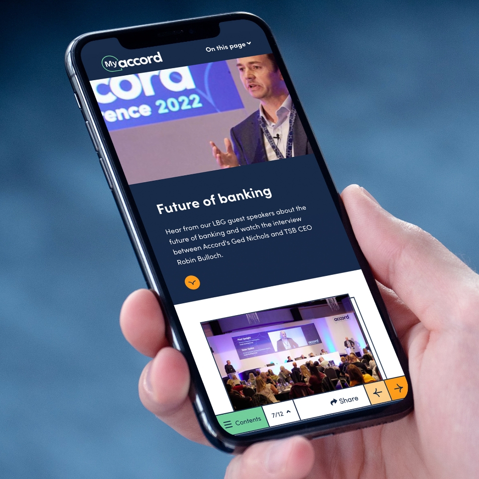
My main goal from this project was to create a digital magazine that was easy to navigate, allowing users to seamlessly browse the content as easily as flicking through the pages of a printed magazine. I achieved this through enabling users to explore the magazine contents in 3 different ways using the navigation bar anchored to the bottom of the page – taking into account the needs of their diverse membership audience with varying levels of technological ability. A simple contents page, a page carousel and clear next and previous buttons are accessible to users at any point enabling them to easily jump around content using the magazine.
Flexible modular design
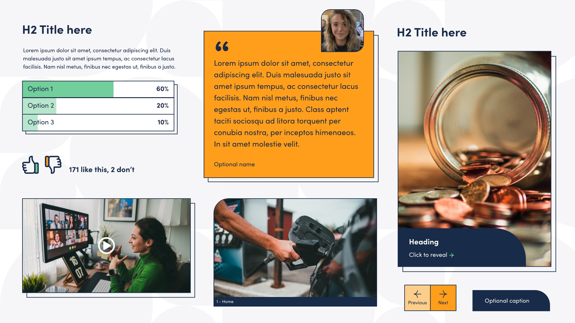
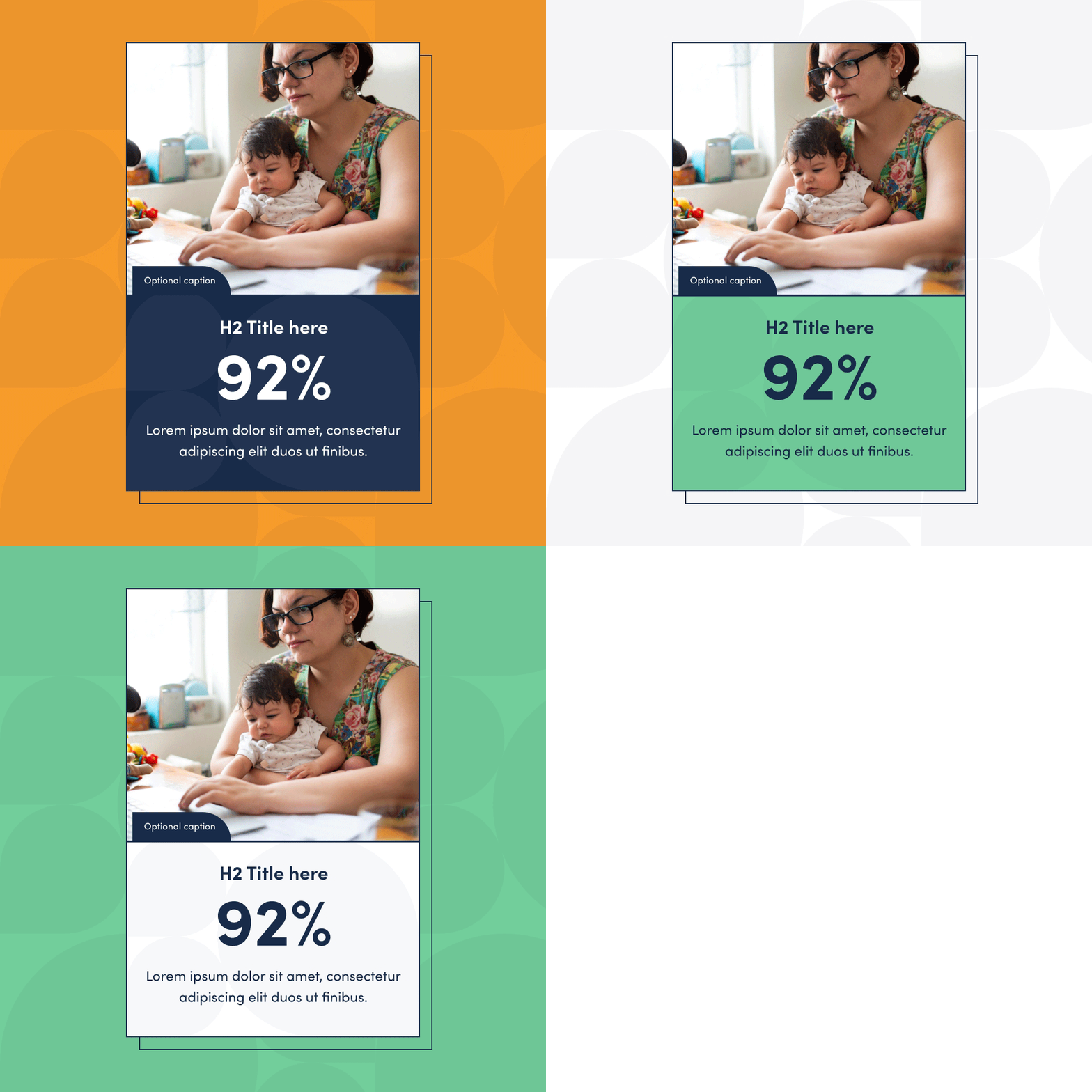
Once I had developed the navigational aspect of the project the next key task was to create a design that would enable Accord to easily build out content pages within each magazine issue in a similar way to laying out a printed page. I achieved this through the creation of various modules accounting for all different types of content including; quotes, stats, videos, articles, polls and more. I designed variations on colour, column size and the ability to adapt imagery so that there is a lot of scope to get really creative with the page layouts so that the magazine has a good pace just as a printed version would. It is great to see how well the design is working and has received hugely positive feedback from members.
