Logo & Branding Collection
Client: Multiple
Services: Brand design, Logo design, Brand application, Re-branding.
Creating a memorable brand that tells the story of your business and brings it to life, representing both your values and purpose is an integral part of the journey for all organisations big and small. Great branding is about much more than just the design of a logo – it’s about creating a visual identity that represents a business leaving a lasting impact that connects with its audience through all visual communications consistently to drive engagement. I have worked on a large number of branding projects across a variety of industries – from the creation of small startups to rebranding national charities, across my freelance work and at Studio Republic. This page is a collection of some of the projects that I have worked on. If you’d like to discuss a branding project for your business please get in touch, I’d love to hear from you.
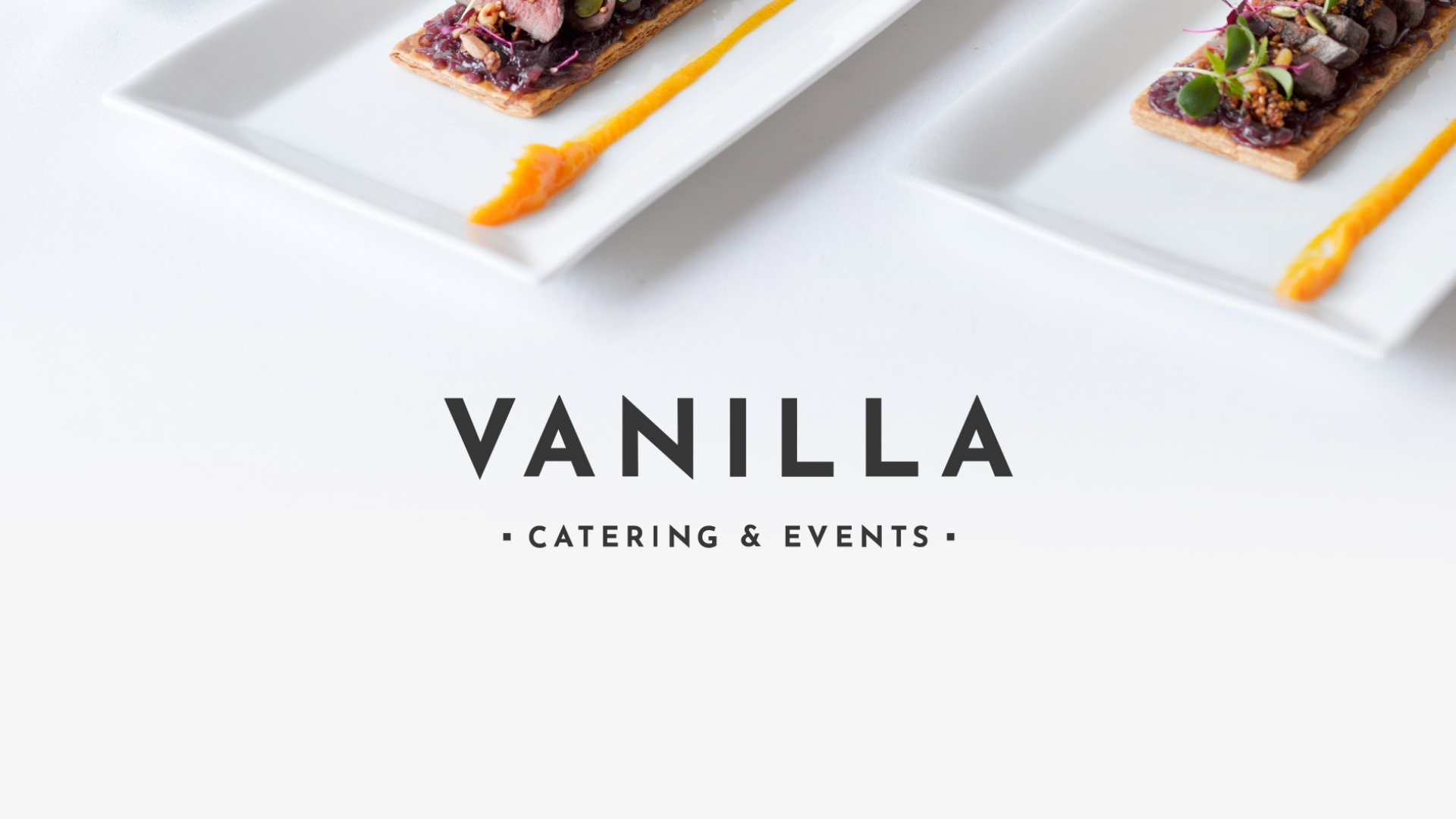
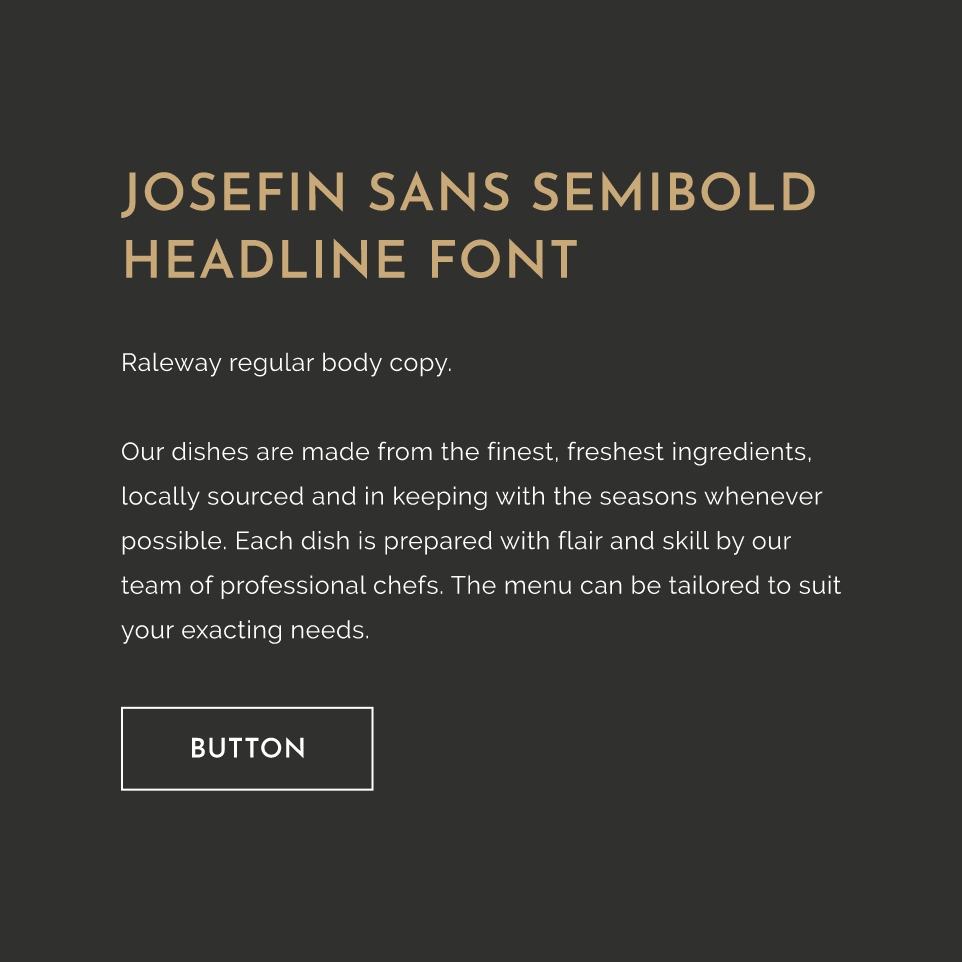
Vanilla Catering & Events
Vanilla Catering & Events are a high-end catering company who specialise in wedding catering and corporate events. They came to Studio Republic with the challenge of modernising their much out-dated brand that was having a negative impact in engaging with their target audience. I created a contemporary brand consisting of a typographic word mark using Josefin Sans chosen for its sharp and clean edges. The friendlier tone of Raleway as the body copy compliments Josefin Sans really well to achieve the balance of personality and quality. Paired with a minimal colour palette to accentuate the amazing colours represented in the imagery of their food I was able to represent the quality of their services through their identity.
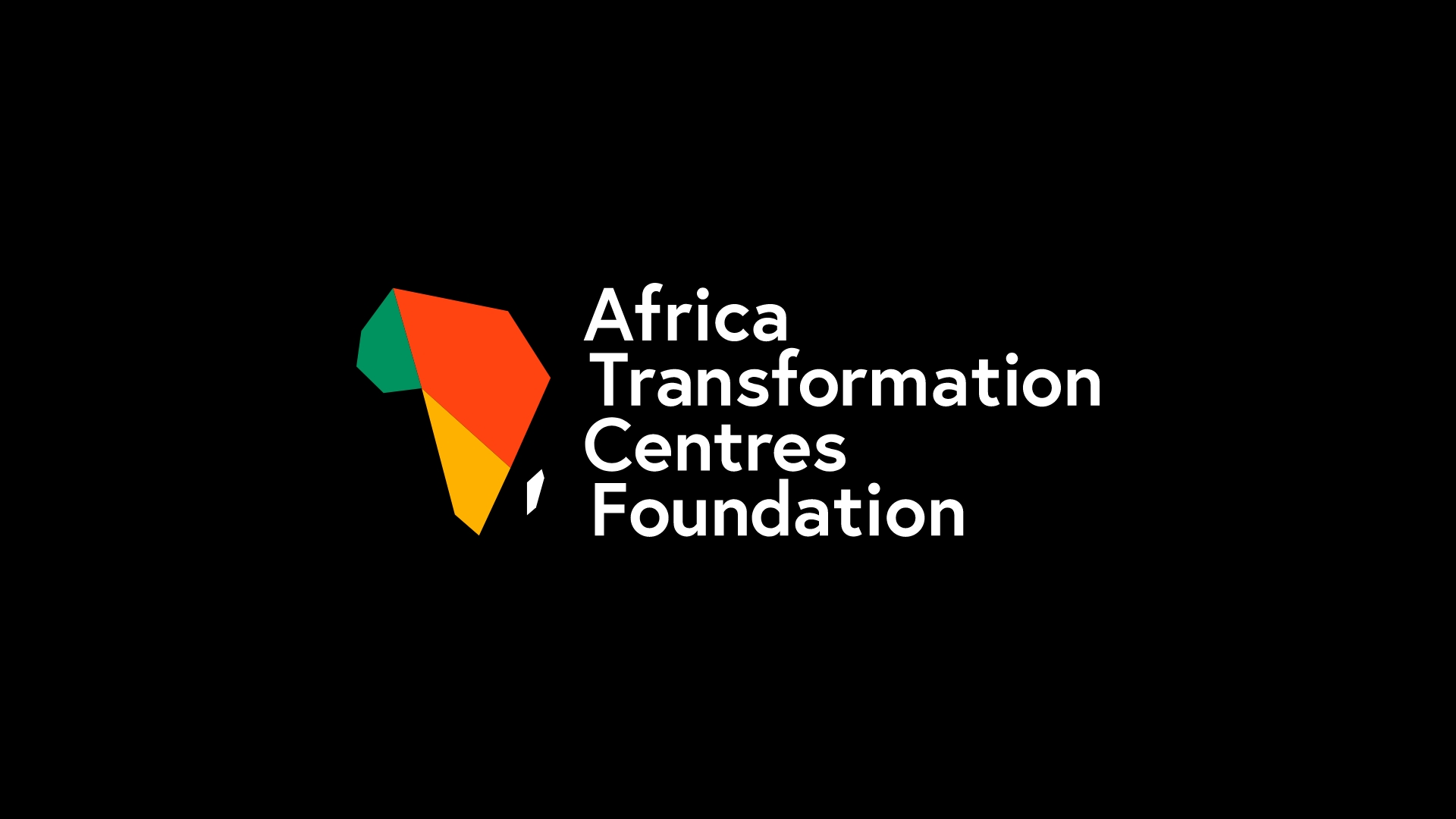
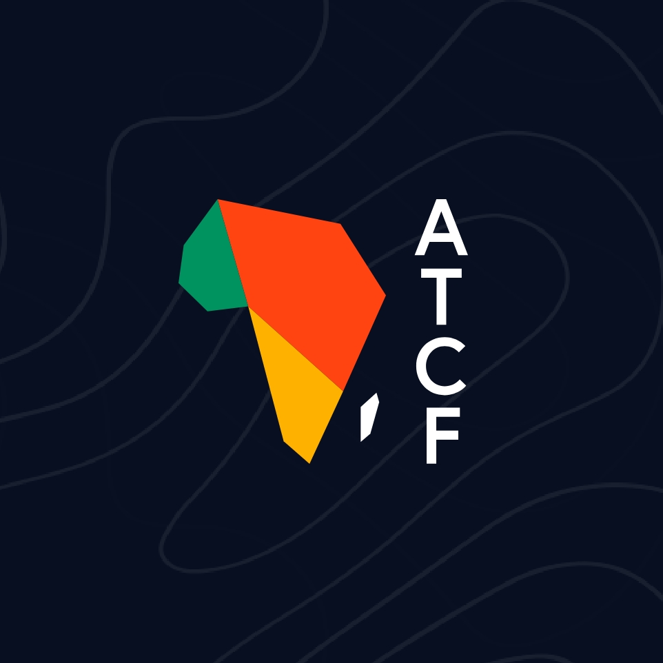
ATCF
Africa Transformation Centres Foundation, known as (ATCF) aim to make significant improvements to life opportunities for every African in every African Country. They came to Studio Republic requiring a new vibrant and inspirational brand to provide them with the platform to achieve their goals. The concept was inspired by traditional African artwork and the geometric shapes used and seen in many African patterns. It draws inspiration from these but modernises it to form the shape of Africa in a simplified form which shows connectivity. The shapes were created with the idea of being fluid building on the idea of transformation and growth.
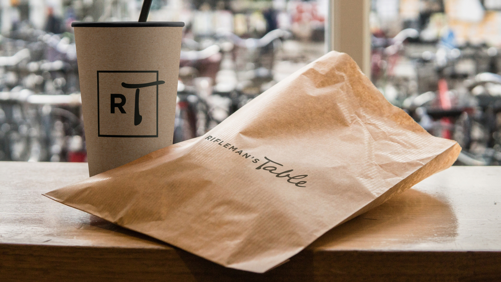
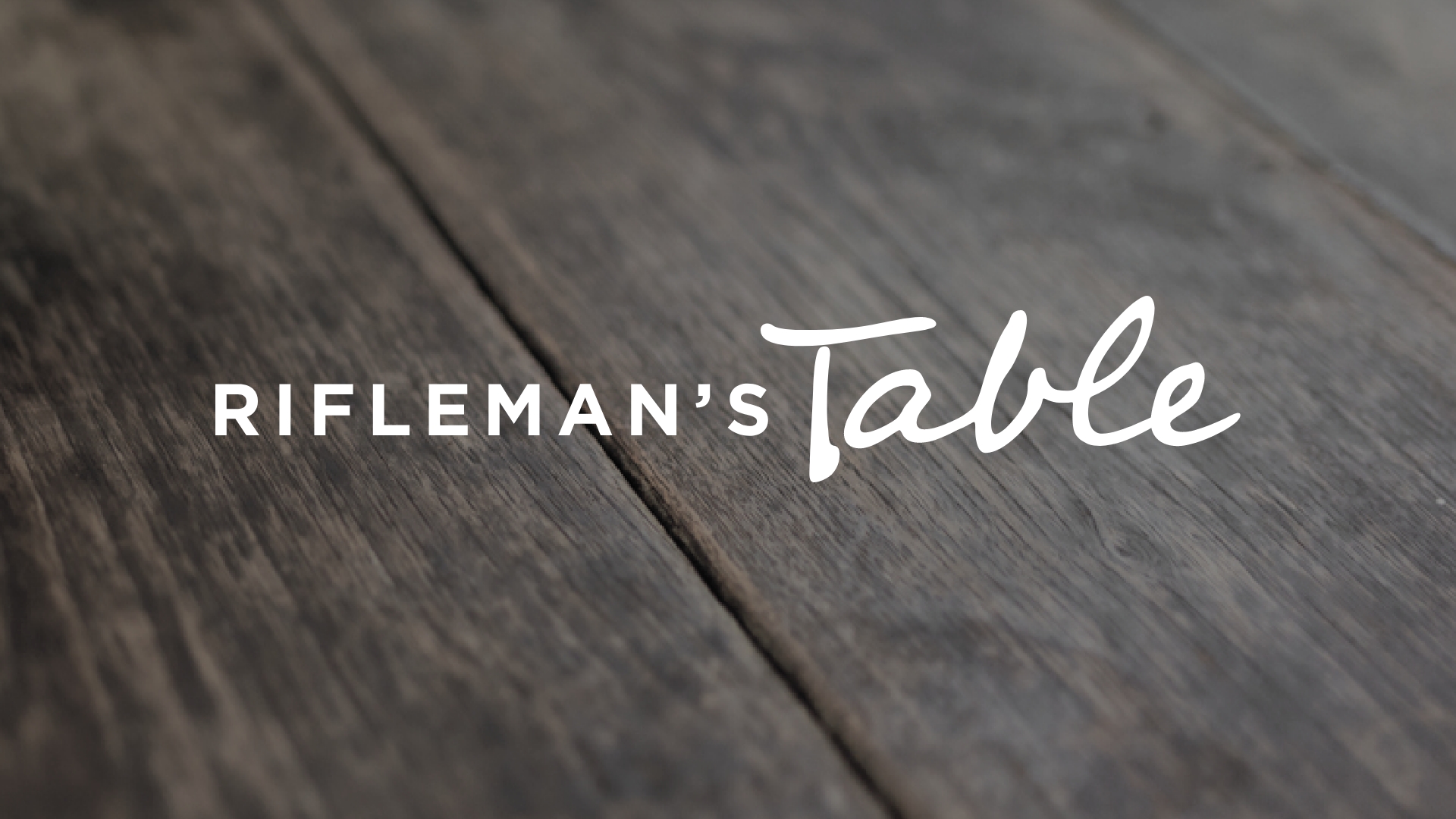
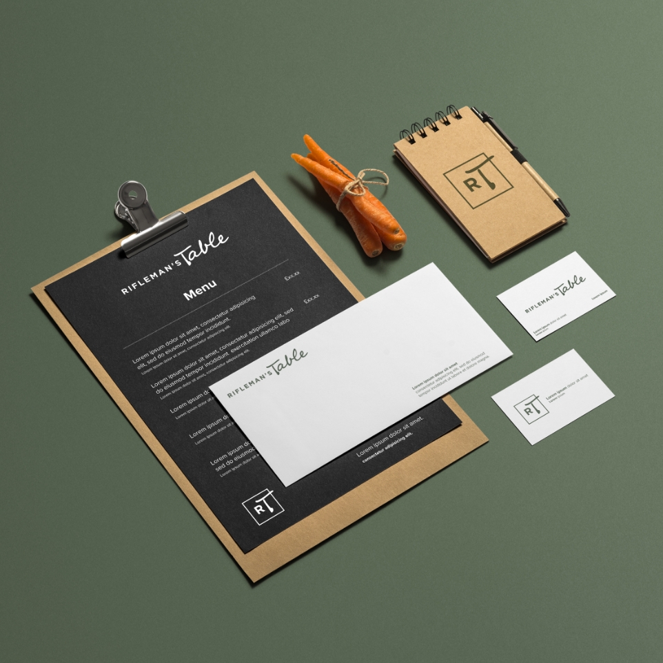
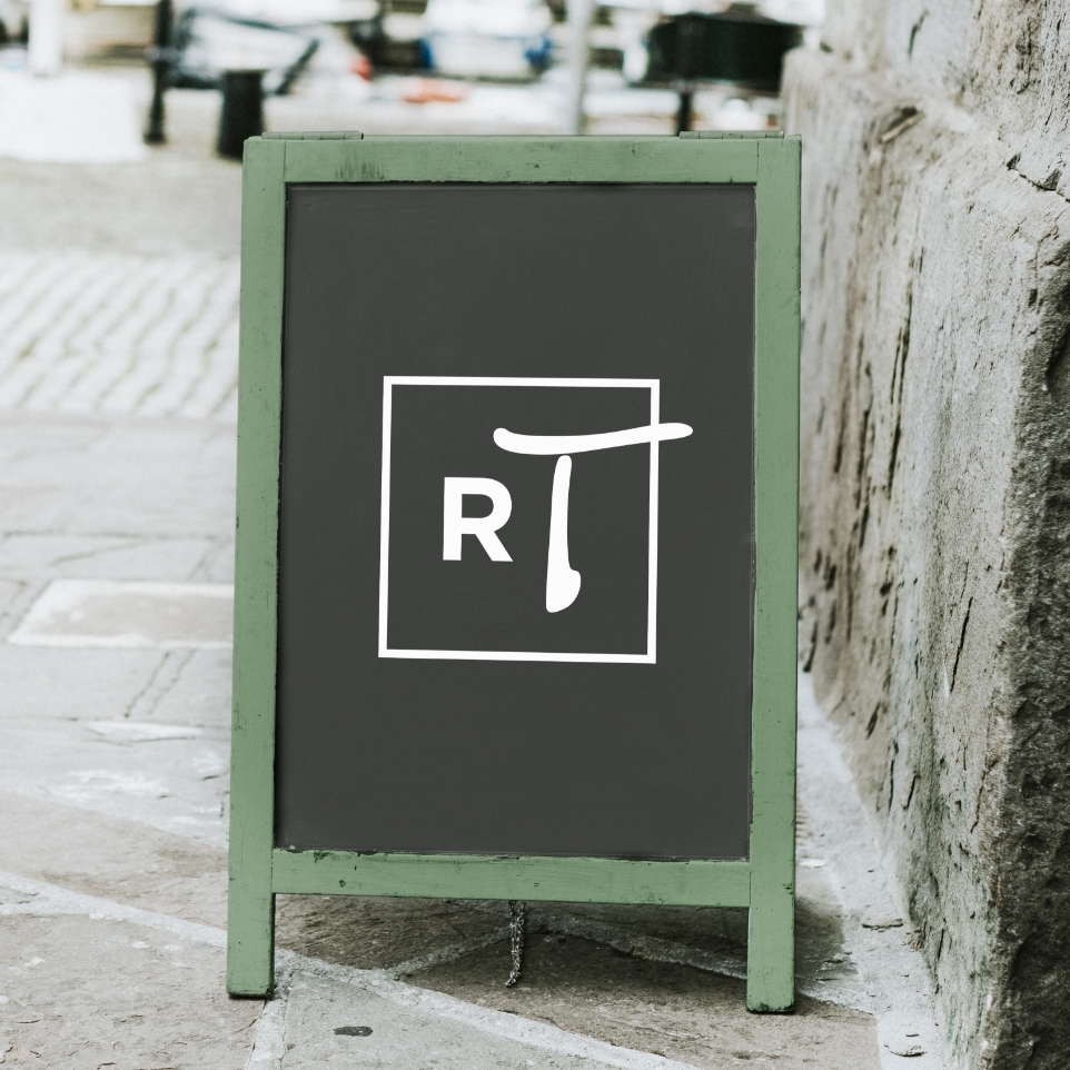
Rifleman’s Table
Rifleman’s Table is a small independent cafe who provide excellent quality food and drinks and a vibrant menu to their customers on the bank of the River Hamble. They came to Studio Republic with a brief to create a brand that reflected their values. I paired Gotham with a hand written font to achieve a beautiful balance between both clean quality and personal character. The dark green colour accentuates the country roots of brand and its sustainable focus.
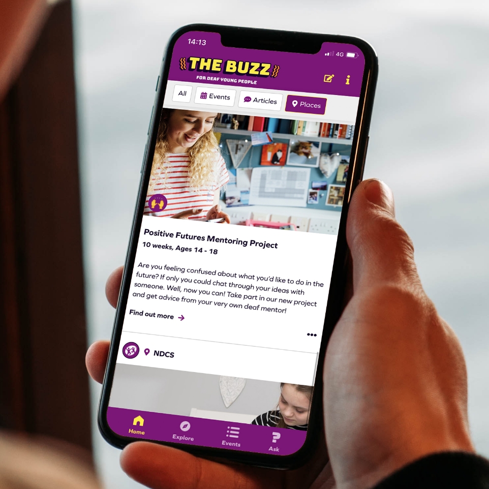
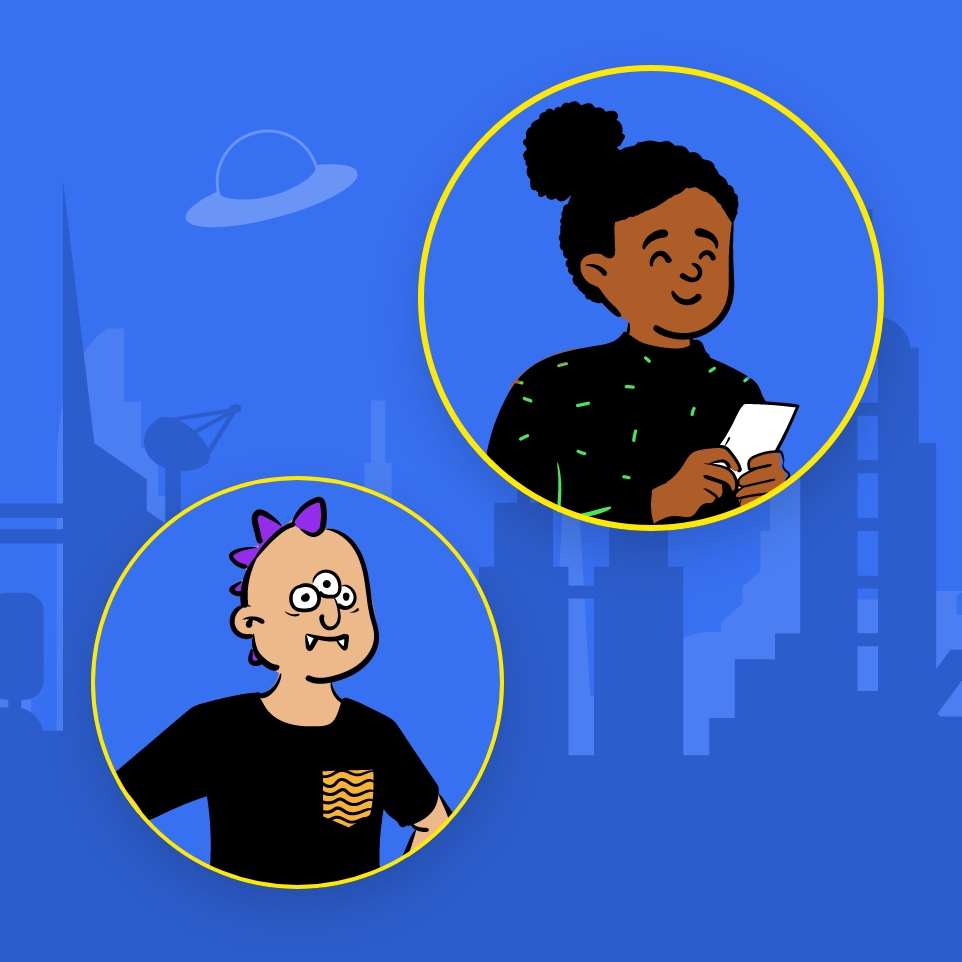
The Buzz (NDCS)
National Deaf Children’s Society required a new brand for their digital platform The Buzz when they came to Studio Republic. The most important challenge was that it needed to engage with their young audience. It was apparent from the young people’s input that they loved the concept of gaming, so inspired by this I created a playful brand that reflects this in the customisable features of colours, backgrounds and avatars in addition to the bold logo.

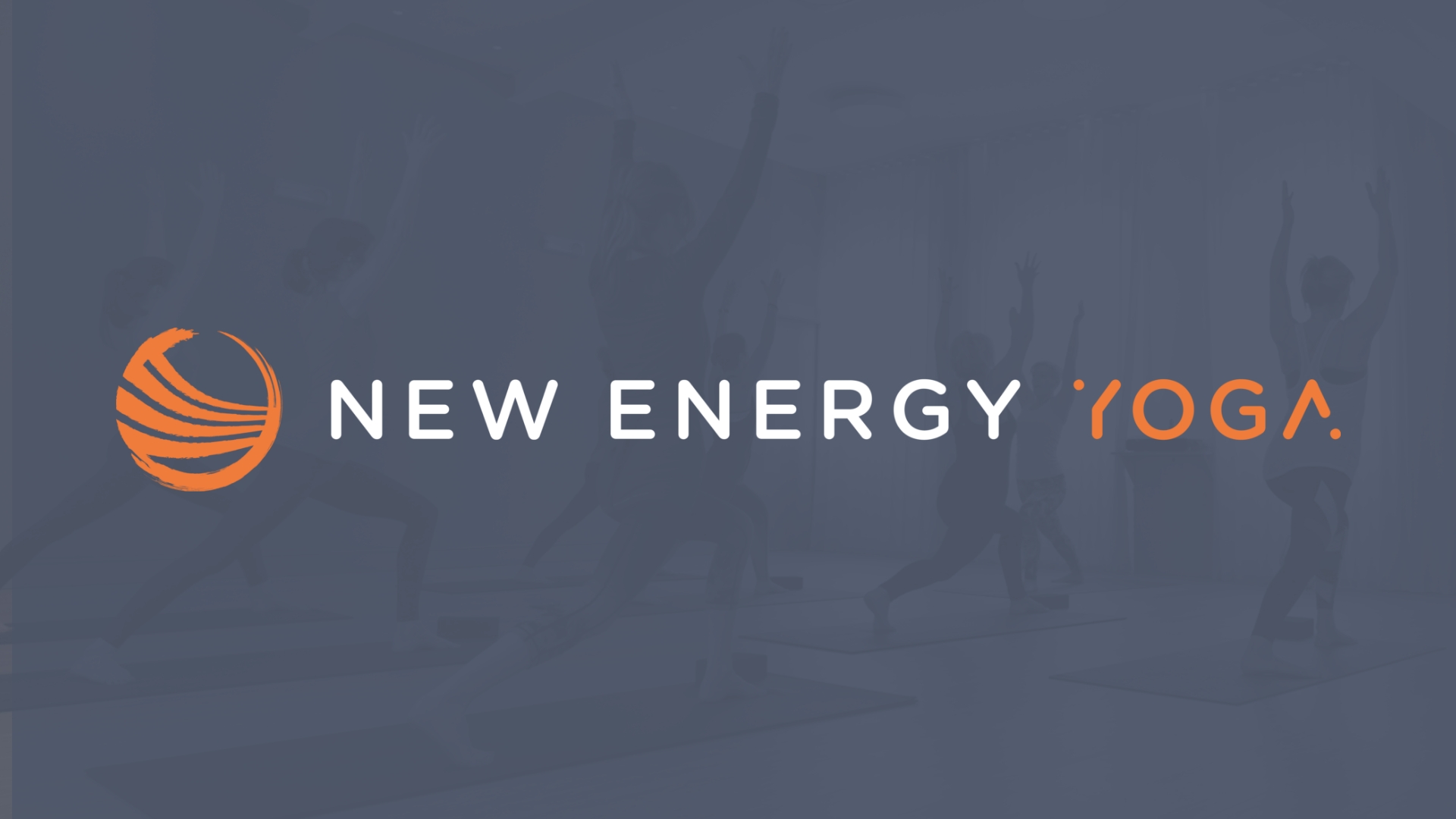
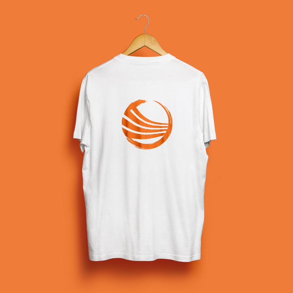
New Energy Yoga
New Energy Yoga are a yoga studio based in Winchester and a sister company of New Energy Fitness. They came to Studio Republic requiring a rebrand as their current brand was just duplicated from the New Energy Fitness gym. As a result it was not resonating with a different audience and was too vibrant and energetic. I softened the brand introducing an organic brush stroke variation of their icon paired with a rounded typeface and softer colour palette, to maintain the link with the parent brand but developing its own identity more reflective of its audience.
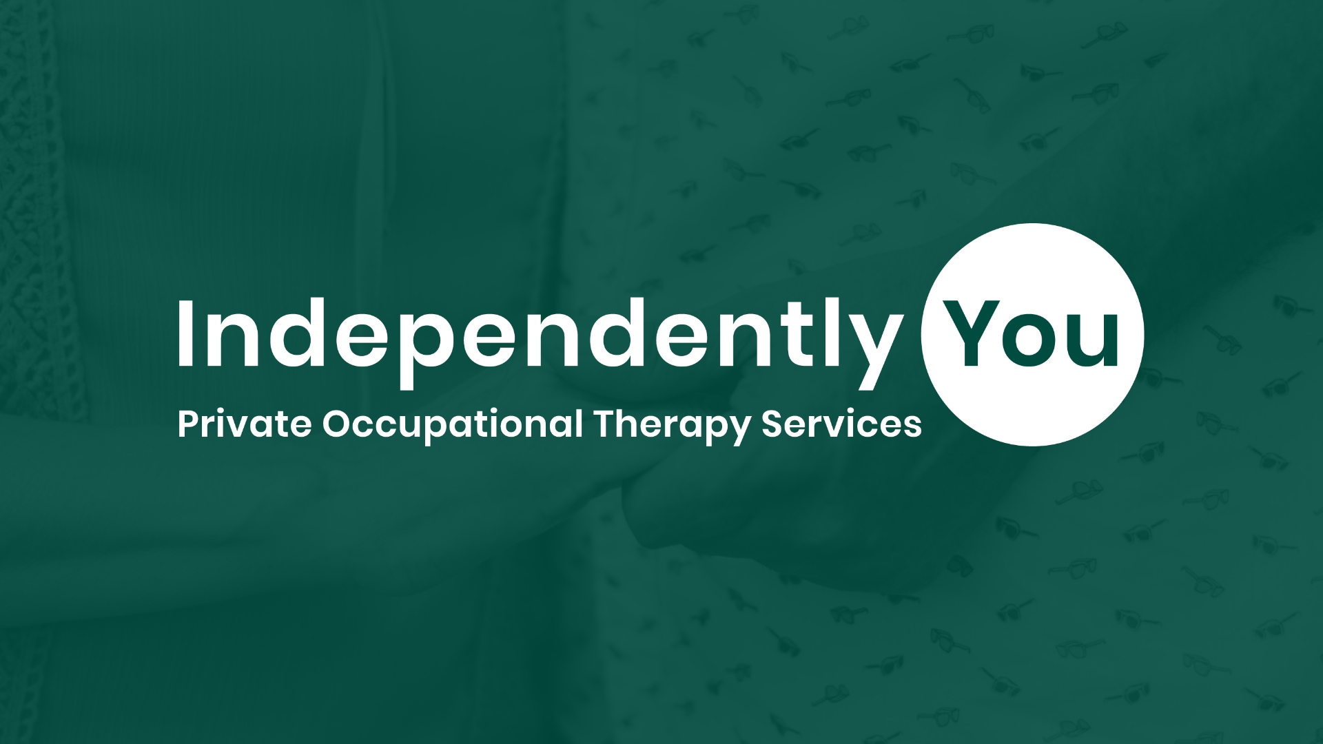
Independently You
Independently You are a small private occupational therapy company based in Dorset. They came to me with the brief of developing a simple yet welcoming brand that would encourage their audience to reach out for support. The concept of the circle surrounding the word you focusses on the idea that their services can make you feel whole and safe.