Ellen MacArthur Cancer Trust
Client: Ellen MacArthur Cancer Trust
Services: UX design, UI design, Brand application, Web design.
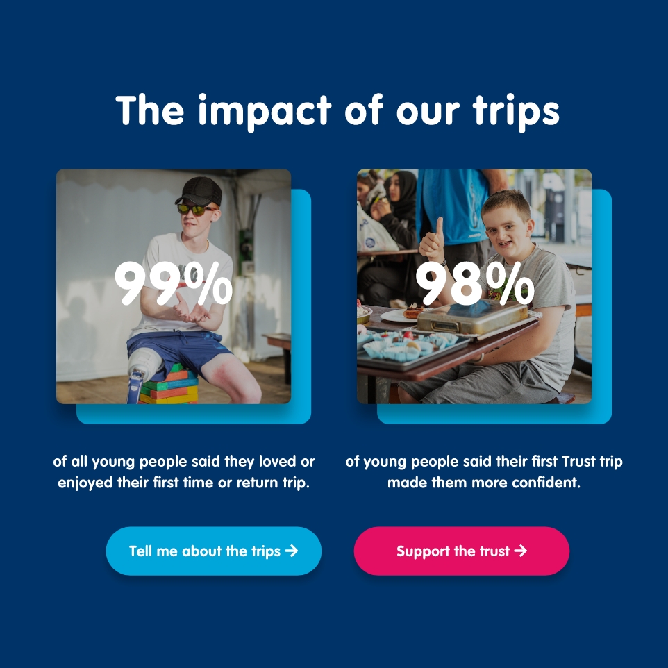
Ellen MacArthur Cancer Trust helps to rebuild young lives after recovering from cancer through sailing trips and activities. Although they benefit from Dame Ellen MacArthur’s name, one of the biggest challenges they faced was a lack of enquiries and donations coming through the website due to a complicated navigation and lack of storytelling showcasing the amazing impact of the Trust. During the scoping process we were able to boil down their 8 key users into 2 key groups, those looking to support the Trust and those interested in the trips. Simplifying these enabled us to focus on building well signposted user journeys that would enable users to navigate the site seamlessly and as a consequence increase fundraising capability and sign ups to trips. This was a project I worked on at Studio Republic where I lead on the UX design building out a new information architecture leading into wireframes and then the application of the brand leading into the design of the interface.
The solution
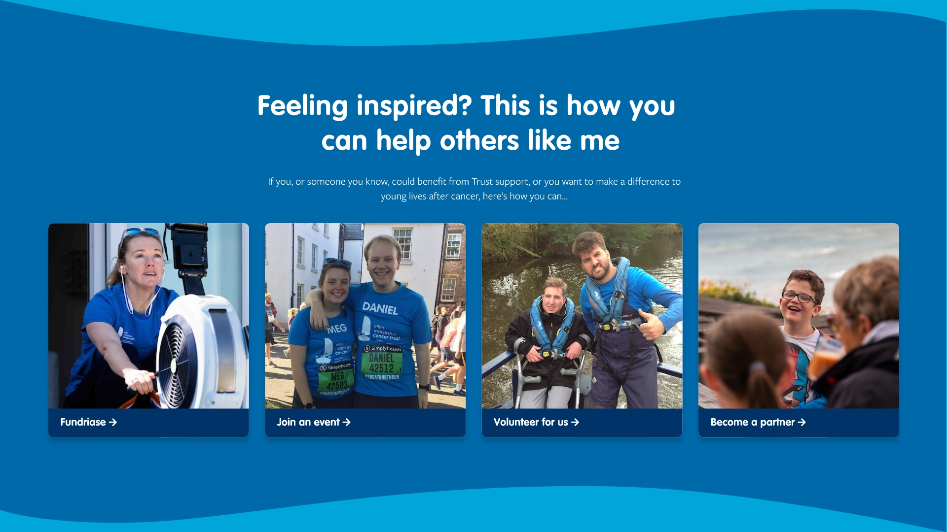
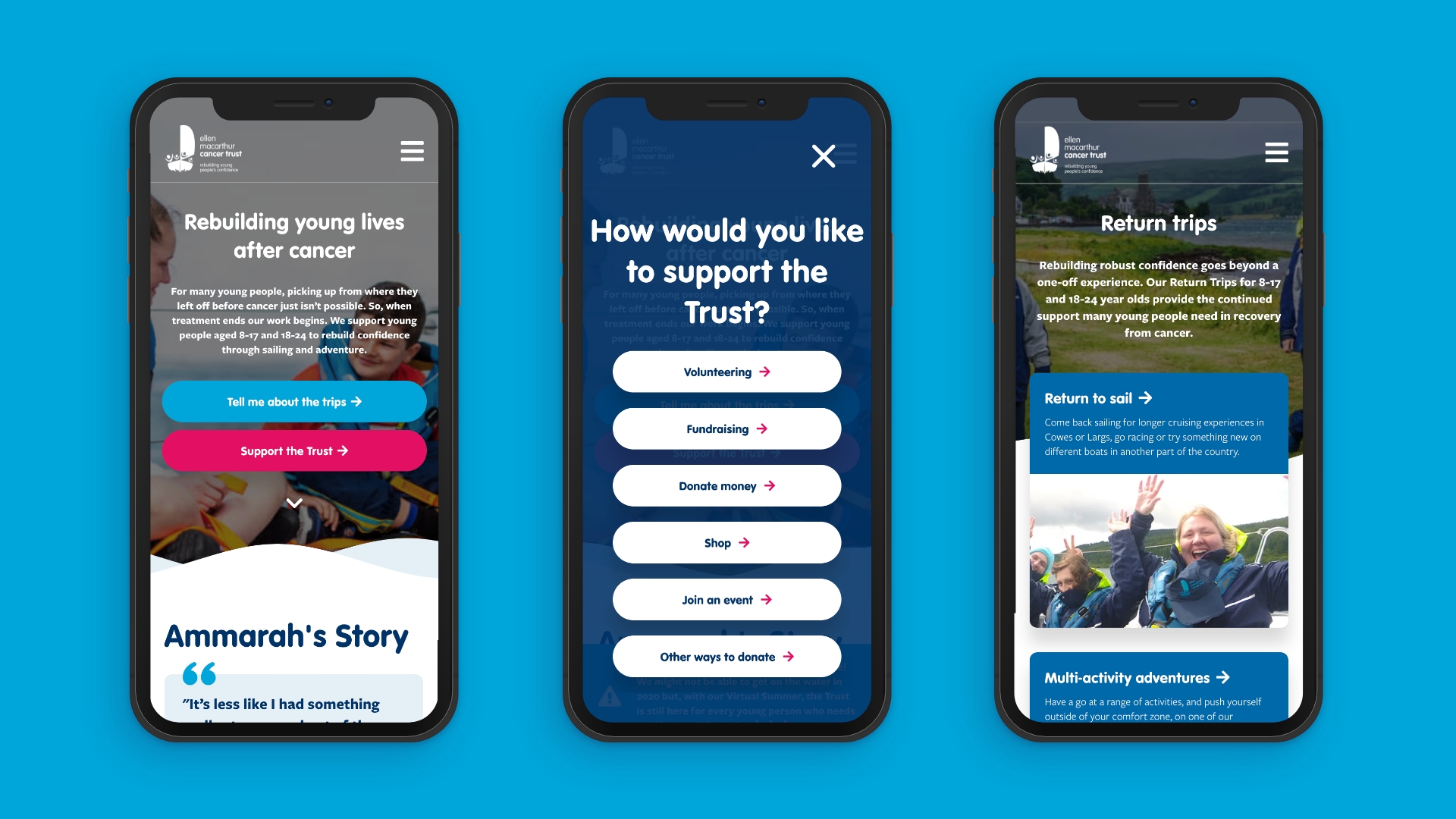
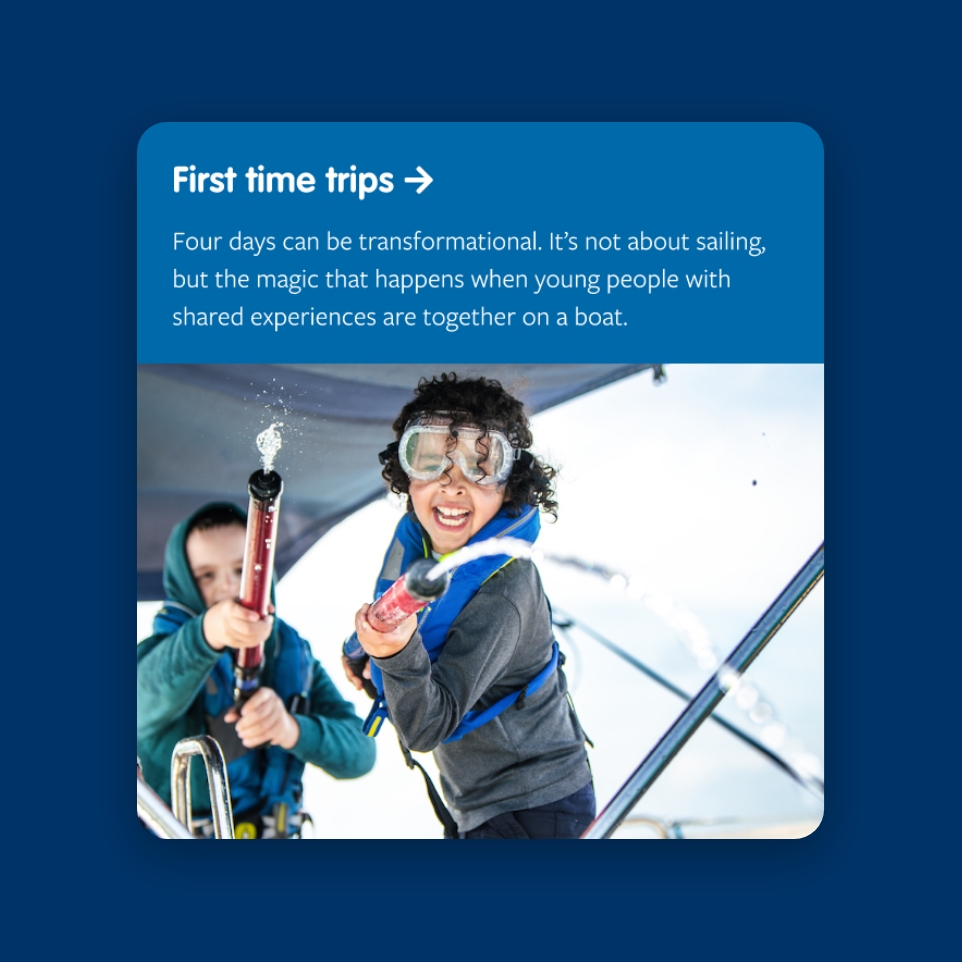
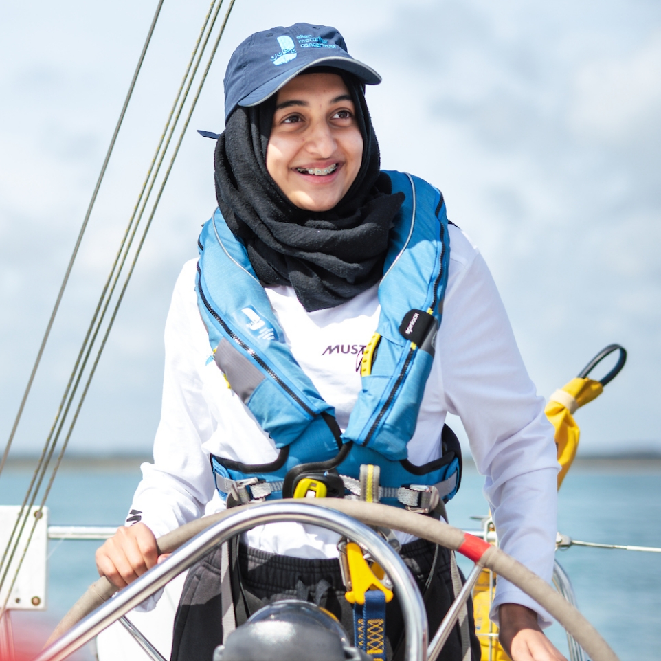
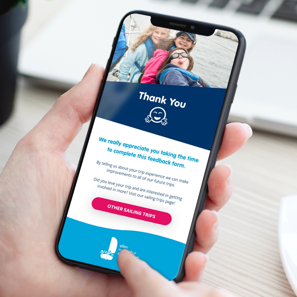
I re-organised the content in a way that allowed different user groups to quickly identify their needs and the areas relevant to them, the ‘Support the trust’ drop down being a key tool to do this. Through the creation and testing of initial wireframes I was able to then build out a structure for the site with a seamless navigation and logical user journeys. Following this foundation I set about designing an engaging new interface that expressed the energy and passion reflected in the everyday work of The Ellen MacArthur team through their amazing imagery and developing their existing brand assets. Accessibility was a key part of my thinking here and I had to tweak their colours slightly to achieve a minimum of AA WCAG grading standards. Utilising the imagery and enhancing the playful elements of their brand I was able to create a site that communicates hope and positivity to enhance the user experience. Following the project I also worked on a post-trip feedback form for young people to engage with, further improving their overall digital experience with the Trust.
A quote from the CEO of the Trust, Frank Fletcher: “We had two really specific needs around recruiting more young people and removing some of the barriers around them joining a trip and like all charities, continuing to raise funds. Our new site has answered those two call to actions really well. We’re really delighted with it.”
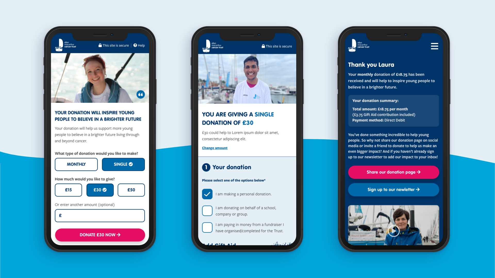
Improving mobile conversions
Upon launch of the site the Trust saw an increase of 312% in donations for the year and a 184% increase in the size of those donations as a result of the enhanced user experience. However with the launch of an upcoming campaign I undertook a review of the donation journey combined with the data with the objective of optimising the donation journey further. I found an opportunity to enhance the mobile experience further through enhancing the donation journey as well as onward steps within the thank you page and donation email. I am always looking to adopt a test and learn approach to designs in order to make well informed tweaks that will continue to increase the user experience and the site’s performance for the client.
